3 ways I would improve the Strava Apple Watch app UI
- Written by Ken McMahon
Strava is a website and mobile app that records and analyses data from athletic training sessions. Location data from a GPS-equipped device and heart rate data from a heart rate monitor are recorded and analysed to provide feedback on performance.
I’ve been using Strava for a couple of years now to keep track of my running and cycling training. Initially I used the Strava iOS app on my iPhone 4, these days I use Strava on my first generation Apple watch. I still need to take my iPhone along because, until I upgrade my watch, the phone is needed for the GPS. Though the phone app is in many respects better than the watch app (it can provide audio cues for one thing, which the watch app can’t for some reason), I use the watch app for two reasons, it provides heart rate data and it’s a lot more convenient to access the device on my wrist than the device in a neoprene wallet half way up my arm.
Generally, the Strava app for the Apple Watch is excellent. Strava has rightly focused on providing just what you need to get the job done, the job being to record the appropriate data for your activity and provide as much useful feedback as possible.
That said, there are elements of the UI design that could benefit from revision. Here are three suggestions for modifications to the UI which I think would make a big improvement.
1. The Start Screen
This is what the start screen on the Strava Apple Watch app currently looks like.

I’m all for simplicity, and that big start button is just what you want. There’s only one thing you can do on this screen, you’re in no doubt about what it is and you’re not likely to do it by mistake. So top marks to Strava for simplicity and functionality.
Wait just a second though. Yes, this is without doubt a start screen, but what am I starting? That word ‘Run’ in the top left corner provides a clue, but its a small one, too small, if the number of times I’ve recorded a run as a ride and vice versa are anything to go by.
I should point out that the app defaults to the last activity, so changing this isn’t something you usually need to do. If you ran yesterday and are running today, you just press START. It’s only, say, if you biked yesterday and are running today you need to keep a look out and change the activity type.
Just changing the text to an icon would be an improvement, moving it to a more central position within the start button would be even better. Like this.

Here you can see the original start screens for running and biking on the top row and underneath my mockups with a central icon.
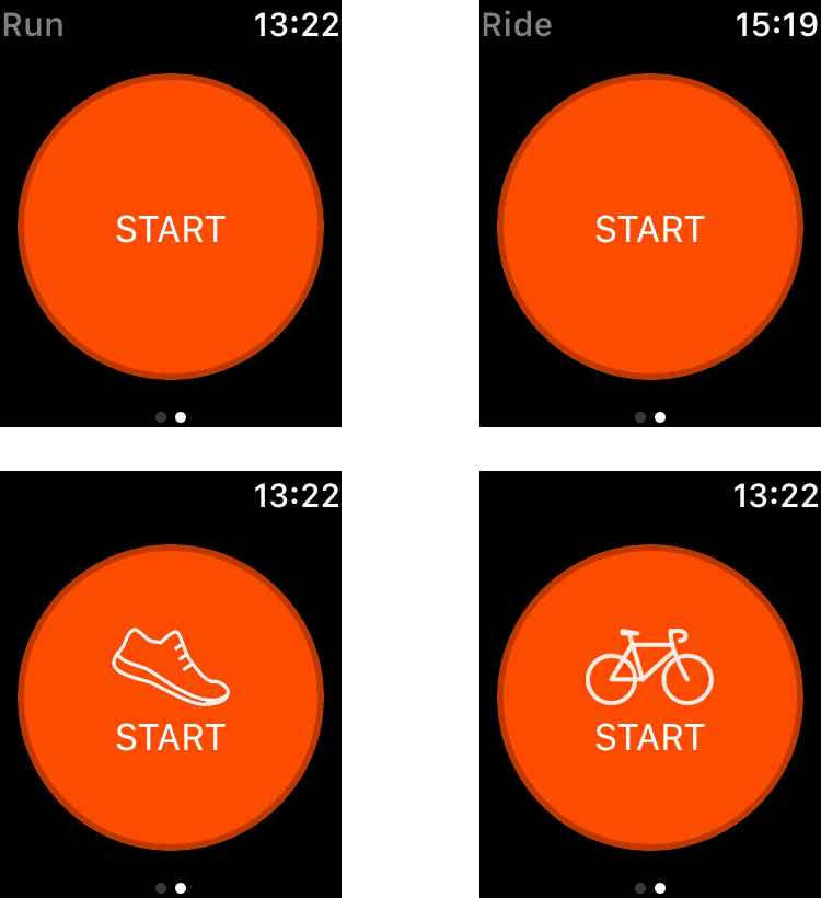
The selected activity is much more apparent and it’s very unlikely you’d begin a run by pressing Start with that bike icon displayed so prominently. The same can’t be said for the text tucked away in the top left corner.
2. Start feedback
What happens when you press that big START button? Usually Strava will begin tracking your activity, on rare occassions it won’t. When it doesn’t it’s really disappointing to discover the problem when you get to the end of your activity; particularly so if it’s a long, gruelling one, or if it’s a personal best attempt or a workout of some other significance (and yes, I often complete an entire workout without so much as a glance at my watch). In all the time I’ve been using Strava it’s happened to me on a handful of occassions, but I’d rather it didn’t happen at all.
So what I do now after pressing that start button is I run or cycle for a few seconds with my arm raised looking at my watch. After what seems like an age, but is in fact between three and four seconds, the start screen disappears and is replaced with a recording screen that shows time and distance information. Once that appears I know all is well and I can lower my arm.
Sometimes, not frequently, but often enough, the start screen just stares back and doesn’t go away. There follows a short period where I repeatedly stab my phone with my index finger, while running, and eventually we get going. (It’s usually during this process that I spot the ‘Ride’ text in the top left and realise I haven’t reset the activity type to ‘Run’ following an earlier bike ride).
There’s a crucial piece of feedback missing here. I need to know for sure when I tap the start button that the tap has been registered and Strava will begin recording. The 3 second wait for the recording screen to appear is doubtless a technical, possibly GPS-related issue, but having to wait for it is not only a nuisance, it could be dangerous. Sensible people will say ‘don’t run then, wait until the record screen appears before you start’, but why should I have to add three seconds onto every activity just because of poor UI desgn?
Eagle-eyed Strava users will tell you there is visual acknowledgement of an activity starting. The start button dims momentarily, for a fraction of a second, if you blink you’ll miss it. It needs to be a lot more obvious.
It’s not possible to make a video capture of the Apple Watch screen but here's a simulation I produced of the start button animation. In my simulation the dimming occurs every 2 seconds, in the app it obviously only happens when you tap the start button.
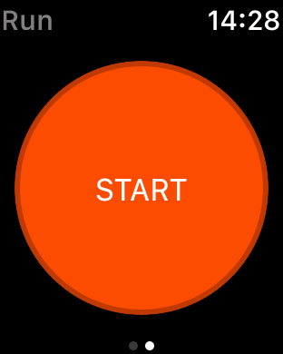
This is pretty close to what happens IRL when you tap the Start button on the Strava watch app. I think you’ll agree this is easy to miss (especially on the smaller Apple watch face). It was only in the course of writing this, during which time I tapped that button quite a lot, that I discovered that if you tap and hold the screen remains dimmed until you release. This makes it a lot easier to confirm that your tap has been acknowledged and your activity is being recorded. But I wonder how many Strava users are aware of this? I'll bet there are a lot who aren't. The solution is simple – dim the screen permanently, regardless of whether the start button is tapped or held, until the recording screen appears.
3. Restore the audio cues!
This one isn't so much a criticism of the graphical UI as a plea for the restoration of a feature that disappeared, I think, with the introduction of the Strava iOS app for the Apple Watch 2. Specifically, audio cues. Or maybe they never were on the watch app, only on the iPhone app, to be honest, I don't remember, I just know that I miss them. Audio cues are nice to have just to let you know when a time or distance milestone has been passed. But for interval training they're essential and I'm sure I'm not the only Strava user now regularly having to use two apps to do interval training. How about it Strava?
Bicycle icon by Martyn Jasinski from the Noun Project
Running icon by Norbert Kucsera from the Noun Project
Share this post


